Director: Jamin Winams
Writer: Jamin Winams
Reviewed by: Dmitrij Polukarov

Topic of the review: Concept Design of the Environment and it's Connection to the Story
Ink is a movie written and directed by Jamin Winams with an independent movie company called Double Edge Films. It's a story about the battle between two forces who exist outside of the real world,but are deeply involved with us. The Storytellers,the warriors that come at night and with a touch to the forehead they bring happiness and joy to people in their dreams. The opposing force are the Incubus,who give happiness to the mind,that result the person's thoughts in to a nightmare. But there's also the the real world and the drifter Ink. The film goes through the connection of three stories and times which are deeply connected. The first story is about the businessman John who is about to lose an important account at his company and finds a way to win the economical battle. But in the back of his mind his family is on his mind. The second story goes around the drifter Ink who kidnaps the businessman's daughter Emma to bring her to an Incubus meeting where he,in exchange,would be turned in to "himself" and released from all the scars in his soul. On their way they meet a storyteller Liev,who tries to convince Ink to remember his true self and how he became the way he is. The third story goes around the storytellers who are trying to save Emma with the help of a blind pathfinder Jacob who can interact with the "beat of the world".
The movie was made with a strong sense of colour and contrast balance to create the mood for the scenes. A lot of scenes show alot of strong contrast where the dark figures shown in an illuminant blank dark way while the white and colourful figures are shown with a strong saturation and soft light. Also the technique of sound and camera work was used to create the scene where Jacob uses his ability,which can also be discussed as a concept idea for a design of the environment. This strong contrast, unstable colour gamma has really created a world that looks like the real one,but is still different and more exciting.
"Ink‘s unique achievement is to materialize a world where invisible metaphysical armies clash over the souls of simple folk with all the fervor of a war fought for oil or for Islam, a fight where each decision a man makes is a strike or a blunder in a grand campaign where failure means damnation."
- 366 Weird Movies
The first noticeable scene would be the Storyteller's world. It's colourful,peaceful and easy to look at. Alot of soft light is added to underline the peace and harmony of the surroundings. It is made in the nature,the forest,to show that harmony created for the sake of balance.

The Storyteller's world.
The second scene with strong colours is the world of the Incubus. It's made in a soft combination of blue-green-black,which are softly combined but also very dynamical saturated. With the help of light reflection of leather materials the viewers can recognise and see more clearly the dark dwellers of this world.
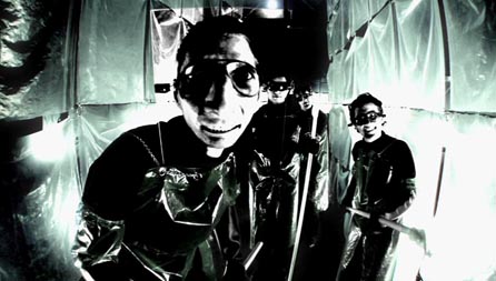
The Incubus's World
"All the different planes of existence in Ink’s world are accompanied by a strikingly different palette of colors and lighting techniques. It not only creates the appearance that they are entirely different dimensions, it becomes other dimensions altogether."
- Midnight Showing
The Dream world is also amde in to several types of dreams. The good dreams,bad dreams and the lost ones.
The good dreams with soft light and and a contrast that is easy to watch. Some blur is added to show the dream-like state of the scene.

The bad dreams are shown like the real world,but with the exception of sudden flashbacks that have a green,poison tone to them.

The lost dream of the dead actress's soul is show in a pink glamour and glory emphasized by the decorations. But the fowers are dead and that first expression of the pink colour quickly dies and is show in a desaturated dead state. It is to show how lost and dead that soul is.

The last scene which was mentioned in the beginning of this review is Jacob's "beat of the world scene". The concept of the scene is that the colours are about average,but with the help of music and the Jacob's musical motion and beat counting the mood and the atmosphere quickly changes in to something more dramatic and epic,but at the same time relaxing and easy to comprehend. Every emotional reaction and simple action becomes something deeply connected with the "beat". The ending of that scene shows just how deeply does the viewer dive in to the atmosphere and the mood with every count and motion.
In conclusion,Ink is a film with rea-time footage from the real world. None of these scenes were created with the help of CG,but with the help of a strong colour and contrast control,every scene has it's own unique individuality.
Interim Online Review 09/11/10
AtsakytiPanaikintiHey Dmitrij,
No lecture from me today! I'm not going to mention the lack of project work available to me to look at (oh - I just did). As a consequence, I've no clue as to what you may or may not be doing. Which is a shame. For both of us. I hope my last intervention re. the emphasis on 'Space' (as opposed to time machines) got you back on track? I genuinely want you to have a great second crit and I genuinely look forward to seeing to what use you're putting your new Photoshop skills... don't disappoint. You should be aware, however, that I'll be asking students about their visual concept - i.e. WHY their spaces look the way they do. I'll be asking about their production design. You'll want to ensure that you've been working conceptually. On your blog there should - by now - be loads of research into your book, into spaces and places, into textures and materials etc. Do I need to worry? Do you need to dread week 10? I sincerely hope not! Come on, Dmitrij - do something extraordinary (and, as importantly) 'on brief.'
Your essay idea sounds strong because you've picked a film with a very strong visual identity.
AtsakytiPanaikintiHere is a list of links back to the CGAA Group Blog, where I have recently uploaded loads of information regarding the way I want students to tackle their written assignments. As you now prepare your unit 2 assignments on production design, pay close attention to the advice given. I will be looking for clear improvement in terms of use of language, academic ‘voice’, use of conventions, argument structure and correct methods of referencing.
Academic style/Do’s & Don’ts
http://ucarochester-cgartsandanimation.blogspot.com/2010/11/cgaa-yr-1-written-assignment-stuff-or.html
1st Person to 3rd person conversions
http://ucarochester-cgartsandanimation.blogspot.com/2010/11/fao-1st2nd3rd-cgaa-students-from-1st-to.html
Use of footnotes
http://ucarochester-cgartsandanimation.blogspot.com/2010/11/fao-1st2nd3rd-cgaa-students-use-of.html
How to satisfy essay criteria/assignment presentation/hyperlink to referencing methods
http://ucarochester-cgartsandanimation.blogspot.com/2010/11/fao-cgaa-yr-1unit-2spacewritten.html
Also – be sure to check out the 2 student essays uploaded to myUCA/Space/Unit Materials – good examples of degree level written assignments. Take the time to read them.